Monday 31 March 2014

Core Lens: Week six


EXPERIMENTATION WITH SHUTTER, LIGHT, AND VANTAGE POINT.


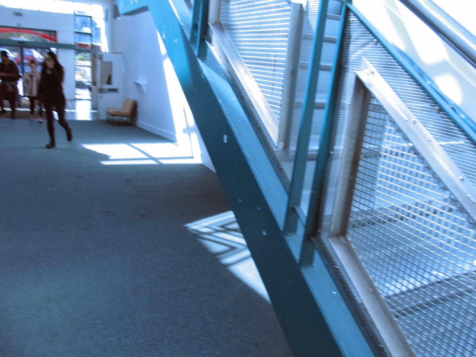
I really like how these two turned out, if I'm completely honest, they were kind of accidents, but I do really like the effect sow shutter gives when you shake the camera, I think it is very effective.


I think these could have worked better if I had changed the ISO and the aperture differently around them, as all go these turned out quite grainy, but it might also be parley to do with the camera used, but I do like the grudge vibe it gives.


For these I played around with vantage point, I found that I could have done some from further away, I feel like that might have been a better decision for what I was going for. Not really sure how much I like these photos.

This photo is my favourite of the lot! I like the light coming for the background, and the motion blur looks really nice and ghostly, although I would like it even more if you couldn't see Kayla's face, so next time I'll try an even shorter shutter.


This one is also a favourite, I like the way the lighting looks and the ghostly silhouette is gives, I like the feeling of movement.

By the time I took this photo I had the camera set to a shutter speed on 1/4, and I really love the blur it gives. 


EDITED EXPERIMENTS.
I edited a few on photoshop, and I think that they turned out pretty rad, I like changing the white and black levels, making the contrast less or more, depending on the picture, I also added a cool filter to the second photo below, and I think it looks nice. The saturation of colour/intensity is also something I like to play around with, its always nice to make a dull dark photo come to life. I think my photography style is greatly influenced my people like Francesca Woodman, and other artists that use motion blur to their advantage, I think it can be really beautiful. I might do and experiment using reflection and harsh lighting, just to see whether I like the look of it. 


Wednesday 26 March 2014

Francesca Woodman. LENS.


Untitled, Italy
Francesca Woodman (American, 1958–1981)
 1977 - 1978
 Photographs
Gelatin silver print, 27.9x 35.6cm

I like the way Francesca uses simplistic imagery, and she creates a dark feeling to her works the draws you in. I really like the use of the subject matter in this work, I like the way the white stands out against the against the grey and black, it draws the eye in, and although white is usually seen as a pure and clean colour, but in this photo is almost poses a a question, like why is the figure in the middle of trees covered in a sheet, what is she doing there? It creates an eerie atmosphere that I really the the look of.


Space2, Providence, Rhode Island
Francesca Woodman
1975-1976
Gelatin silver print25.4 x 20.3 cm

I choose this photo as an example of motion bur, as I would like to use this technique in my own work, I like the feeling of movement and the feeling it gives you, and the way you can't tell who the person is or what they look like.

RRAW: Week 2b exercise 2

STATEMENT OF INTENT.

For my blog I want it to be a place where I can display my drawings and paintings in a formal manner. I also want to be able to keep it personal and be able to write about the meanings and stores behind my works so that the reader can understand it better, and really feel it. I want my blog to an area of self expression for myself.

RRAW: Week 3a exercise 3

Photography.
Photography is a way in which an individual can express themselves, thoughts, feelings and interests.
Photography is used in many ways to capture things that are interesting to the photographer
Photography is a good way to document things, e.g.. memories, events etc.
Photography is one of the most superior forms of art.
A lot can be read through a photograph - "A picture is worth a thousand words" - Frederick R Bernard 1921.

RRAW: week 2a exercise 3

blogdelanine.blogspot.co.nz
Geninne writes a blog showcasing her art through varying medias and techniques. Her work ranges from designing scented candles to painting pebbles and making japanese style pottery. Her designs are so pretty!

http://danitaart.blogspot.co.nz
Danita posts blogs about her work which ranges from sketching to sewing. I LOVE the dolls she makes, and I love the amount of small details she puts into them, they are beautiful.

I'd like to run a blog where I can post about my work, and other peoples work and processes of how I make things. I'd like to be able to post whatever I feel is fitting or inspiring in for myself and for others.

RRAW: Week 2b exercise 3

My friend Rachel has been a big part of my life since I was around the age of 13. Although she is younger than me in age, by being one of my best friends she has taught me a lot about what it is to be a true friend. I've always been the kind of person to think that the older you are, the wiser you are, but it turns out I was wrong (which tends to happen a lot). When it came to Rachel I was mistaken as she was wiser than me even though she was younger and still is wiser than me to this day. When I first met her she was 11 and I was 13, I felt like the "cool" older kid and in reality I'm actually quite shy and socially awkward so I have no idea what I was thinking. Rachel has this way with people that I'll never fully be able to grasp myself, but to her it just comes off effortless. She is wise beyond her years and gives advice that I'd never have thought of and I will always look up to her for that.

RRAW!! Week 2b exercise 3

For me this image comes across foggy splotchy, and damp at first, it makes you feel cold just by looking at it. After I looked at the image for longer, I noticed more o the details and small features the artist had put in to the image, the patterns and the way that it resembled nature in a quirky kind of way. The image only has three colours, white, black and green this gives it a bold eye catching look without becoming overpowering, and the patterns remind me of vines trailing down a wall, which adds to the natural vibe this image gives off. Despite the image looking bold, it also looks fresh and crisp, like the smell when you first go outside after a frost, this is because of the cool colours used, and also the way the colours are splashed on too look watery and painterly. In the bottom right hand corner there is a rectangular shape which resembles a gate, or a door, which then leads me to think this is actually a painting of the front of a house of some sort. The door almost appears out of place with its geometric lines and structure, but in blends in well because of the colours, which is why I didn't see it at first, because it blends in so nicely.

Monday 3 March 2014

Core skills Lens Week two, "wrong photos"

Blur.
Under exposed 
Colour Cast.
Over exposed

Core Skills: Lens Week one

Space², Providence, Rhode Island, Francesca Woodman, 1975-1978, Photograph gelatine silver print on paper, 139 mm x 139mm 

Vivan Maier, 1954

Cindy Sherman, Untitled Film Still #58, 1980, Gelatine silver print, 20.3 x 25.4cm